Modern Vintage
Role: Lead designer.
The Fossil brand image was founded on vintage Americana. When I started working for the brand in the mid 2000's a large portion of the watch assortment moved to a more classic and familiar aesthetic that would appeal to the masses and could be worn for any occasion. With an understanding of the brand’s history, I decided to recapture that nostalgic element lost in the assortment while staying relevant. But what did nostalgia mean to our younger customer? What was “vintage” to them?
The Fossil brand image was founded on vintage Americana. When I started working for the brand in the mid 2000's a large portion of the watch assortment moved to a more classic and familiar aesthetic that would appeal to the masses and could be worn for any occasion. With an understanding of the brand’s history, I decided to recapture that nostalgic element lost in the assortment while staying relevant. But what did nostalgia mean to our younger customer? What was “vintage” to them?
Using the core age range for my category customer of 16-25 years I sought inspiration for a design sensibility that felt fresh but also drew upon visual cues
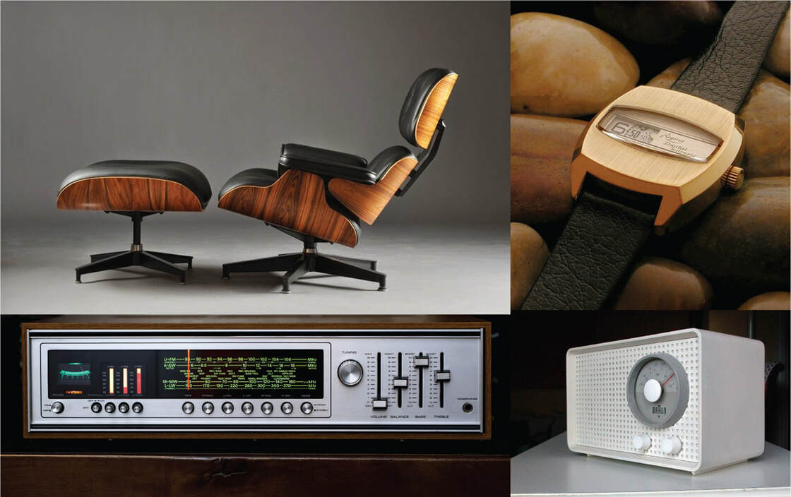
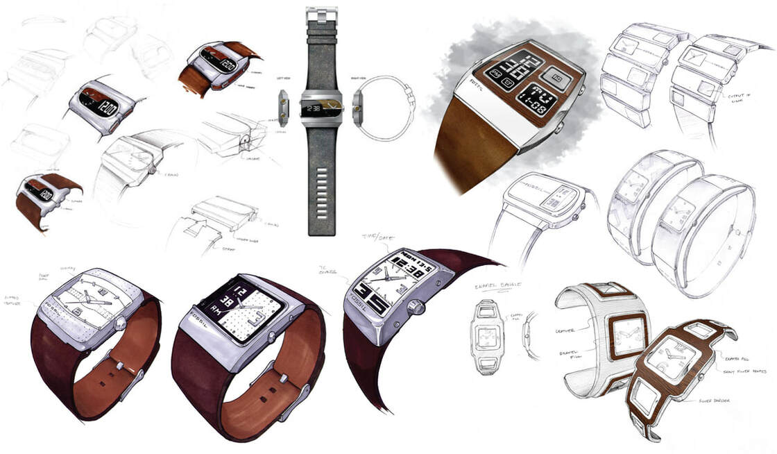
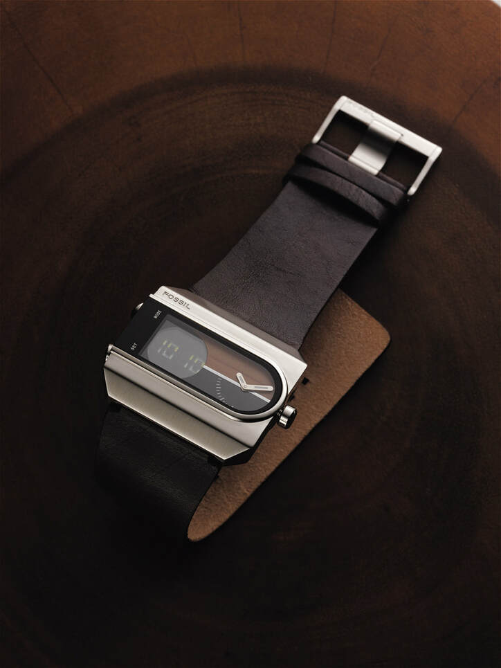
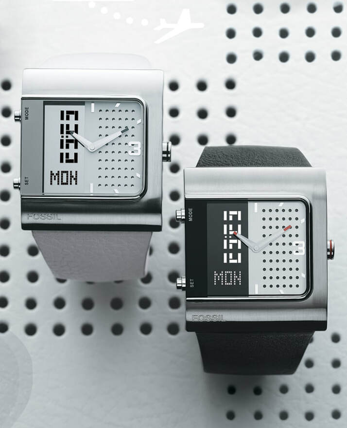
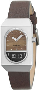
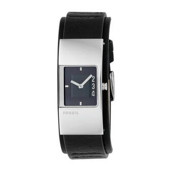
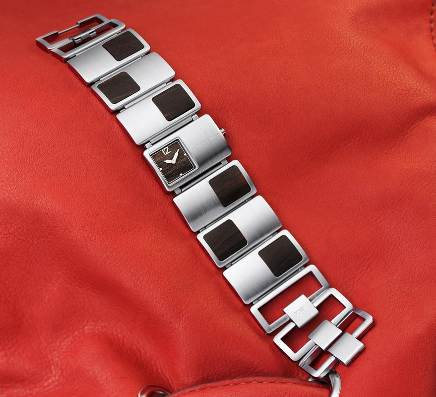
of the customer’s idea of vintage at the time. I realized Americana from the 30’s through 50’s has a universal appeal, but didn't necessarily connect with the younger consumer since they are too far removed from this era to feel a personal connection. Most consumers in that age range remembered their mom's old car, or grandpa’s stereo, or the Betamax in the living room. These products create a stronger connection since consumers that grew up in the 80s and 90s had either encountered these products in their youth, or even inherited/rebought the models for themselves. The distinctive look of steel, black displays and wood with clean lines and a modern aesthetic guided the design language for this collection. I designed the display font to fit right into the story.
of the customer’s idea of vintage at the time. I realized Americana from the 30’s through 50’s has a universal appeal, but didn't necessarily connect with the younger consumer since they are too far removed from this era to feel a personal connection. Most consumers in that age range remembered their mom's old car, or grandpa’s stereo, or the Betamax in the living room. These products create a stronger connection since consumers that grew up in the 80s and 90s had either encountered these products in their youth, or even inherited/rebought the models for themselves. The distinctive look of steel, black displays and wood with clean lines and a modern aesthetic guided the design language for this collection. I designed the display font to fit right into the story.
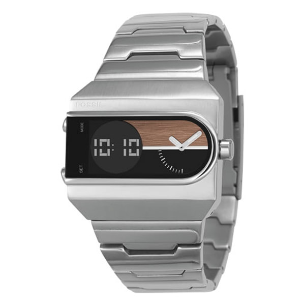
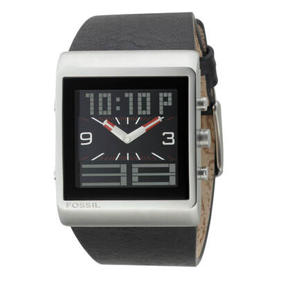
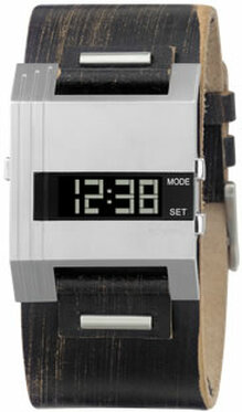
Shortly after launch, the model below (JR9121) became the best selling watch for the brand. Around the same time the brand team started planning the “Modern Vintage” ethos where mid-century modern influences would permeate the look and feel of every category, and each season was gauged on a linear scale between “modern” and “vintage”. This watch collection fit right into the new direction. Nine years after JR9121 came to market it was relaunched
to bring back the once-popular look.
to bring back the once-popular look.

